
"Roar! I'm Taro the Tiger. Let's explore the Jungle of Knowledge!"
Mastering Data Interpretation (au Year 1 - B) | Fun Learning
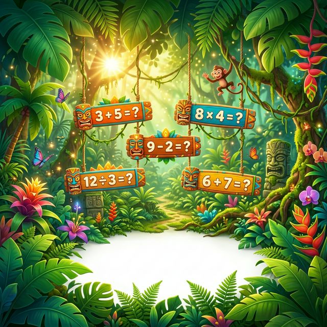
Swing through the vines and discover hidden math treasures in our tropical academy!
Start Safari! 🚀
✨🌟🎓
12k+ Young Explorers
✨ Magical Challenges ✨
Can you solve these mystery puzzles?
🧪
📏
🔢
🎨
Q1
Which of the following chart types is most suitable for visualizing the trend of a single continuous variable over time?
Q2
When comparing the proportions of different categories within a whole, which chart is generally the most effective?
Q3
A scatter plot is primarily used to identify:
Unlock the full mock exam and analytics.
Timed practice, detailed explanations, and score reports.
Upgrade to continue🎮
Level Up
Watch your math powers grow as you complete side-quests and gain XP!
🛡️
Safe Space
A moderated playground where the only target is learning and fun.
📊
Report Hub
Parents can see all the magical milestones in their personal dashboard.