
Responsive Design Mastery Hub: The Industry Foundation Pract
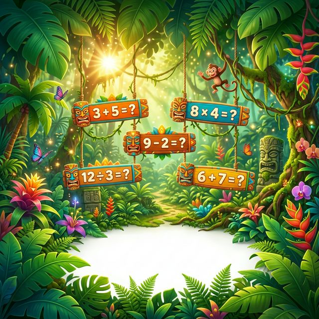
Swing through the vines and discover hidden math treasures in our tropical academy!

✨ Magical Challenges ✨
Can you solve these mystery puzzles?
When designing a responsive layout with Flexbox, what is the primary mechanism for controlling how flex items adjust their size to fill available space within a flex container?
In the context of CSS Grid, what distinguishes `grid-template-areas` from `grid-template-columns` and `grid-template-rows` in terms of layout definition?
Consider a scenario where a Flexbox container has `justify-content: space-between;` and multiple flex items. If one of the flex items has a `flex-basis` that exceeds the available space after accounting for the spacing between items, what is the most likely outcome for that specific item?
Unlock the full mock exam and analytics.
Timed practice, detailed explanations, and score reports.
Upgrade to continueLevel Up
Watch your math powers grow as you complete side-quests and gain XP!
Safe Space
A moderated playground where the only target is learning and fun.
Report Hub
Parents can see all the magical milestones in their personal dashboard.